In what ways does your media product use, develop or challenge forms and conventions of real media products?
For my film trailer(s), I created the fictional psychological thriller/found footage film “The Project”. The film is inspired by films of similar genres, “Chronicle” (Dir. Josh Trank, 2012, “The Blair Witch Project” (Dirs. Daniel Myrick & Eduardo Sánchez, 1999, US) and Paranormal Activity” (Dir. Oren Peli, 2007, US).
After viewing these trailers, I found that the trailers mostly contained elements of dialogue relative to the plot (without revealing spoilers), with title graphics: plot descriptions (One student.. one killer.. one chance), reviews ("Mindblowing!" Daily Paper) and major cast/crew appearances ("Starring Oscar winning actress..." "From the director of...."). Because a similar layout is conventional in most contemporary commercial films, I decided to style my trailer like this.
To keep my trailer short, but still entertaining, I decided to include a small a cast as I could, whilst also including the most mysterious lines of dialogue, as well as teasing the plot as much as I could, without ruining the ending.
How effective is the combination of your main product and ancillary texts?
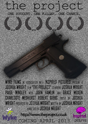
For my ancillary texts, I styled both my magazine front cover and my film poster on conventional posters and magazine covers.
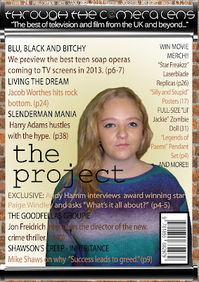
My magazine front cover includes a skyline, masthead, main image, barcode and cover lines, all styled in similar fonts and colours (apart from "the project", which is styled in the same font and colour as both the logo on the film poster and in the film trailer.) The style of the magazine cover is based on a brick wall/projection screen background, reinforcing the film subject.
The film poster includes the film logo at the top, along with the tagline seen in the trailer (ONE STUDENT. ONE KILLER. ONE CHANCE.), a film 'credit block' that appears on the majority of contemporary film posters, a background styled on the 'tv static' graphic that appears during the title graphics of the trailer.
What have you learnt from your audience feedback?
From my feedback, I learnt that my initial film magazine cover, based on the adult novel “Fifty Shades of Grey” had a layout and an overall look that was too similar to a film poster, and not a magazine cover. I took the advice and tips on board, and after a redesign of my magazine cover, I decided to rename the fictional magazine to "Through the Camera Lens", including a camera lens graphic in the first 'A' of camera.
How did you use new media technologies in the construction and research, planning and evaluation stages?
For my ancillary texts, I styled both my magazine front cover and my film poster on conventional posters and magazine covers.


My magazine front cover includes a skyline, masthead, main image, barcode and cover lines, all styled in similar fonts and colours (apart from "the project", which is styled in the same font and colour as both the logo on the film poster and in the film trailer.) The style of the magazine cover is based on a brick wall/projection screen background, reinforcing the film subject.
The film poster includes the film logo at the top, along with the tagline seen in the trailer (ONE STUDENT. ONE KILLER. ONE CHANCE.), a film 'credit block' that appears on the majority of contemporary film posters, a background styled on the 'tv static' graphic that appears during the title graphics of the trailer.
What have you learnt from your audience feedback?
From my feedback, I learnt that my initial film magazine cover, based on the adult novel “Fifty Shades of Grey” had a layout and an overall look that was too similar to a film poster, and not a magazine cover. I took the advice and tips on board, and after a redesign of my magazine cover, I decided to rename the fictional magazine to "Through the Camera Lens", including a camera lens graphic in the first 'A' of camera.
How did you use new media technologies in the construction and research, planning and evaluation stages?
During pre-production, I used the social media websites Facebook and YouTube, to research and increase my knowledge of existing found footage/psychological thriller films, using websites like IMDB and the Guardian Film websites. I used these websites as Guardian Film and IMDB are both genuine sources of information on film, Facebook is readily available on my home computer, as well as my smartphone, and has lots of fan reactions of the films, and YouTube has a large amount of trailers and fan reviews.
During production, I decided to use my own camera. I did this because the camera had been bought previously because of this coursework, and it would mean the camera would be available more, rather than a shared college camera. I used my email program to contact my cast members to organise filming schedules. I also used Adobe Photoshop to create and begin editing my ancillary texts, because of the availability of the program both at home at at college, as well as because it has more effects and can edit more freely than programs like Paint, which is far too simplistic for the graphics I wished to produce.
During post-production, I used Adobe Premiere Pro to edit the main trailer, as well as continuing to use Photoshop for both my ancillary texts,as well as the graphics in the trailer. I also used the royalty-free audio library website freesound.org for the 'TV static' sound effects, and Adobe After Effects to create the 'TV static' graphic. I used Adobe Premiere Pro as it and can edit more freely than programs like Windows Movie Maker, which does not allow the user to edit in as much detail.


